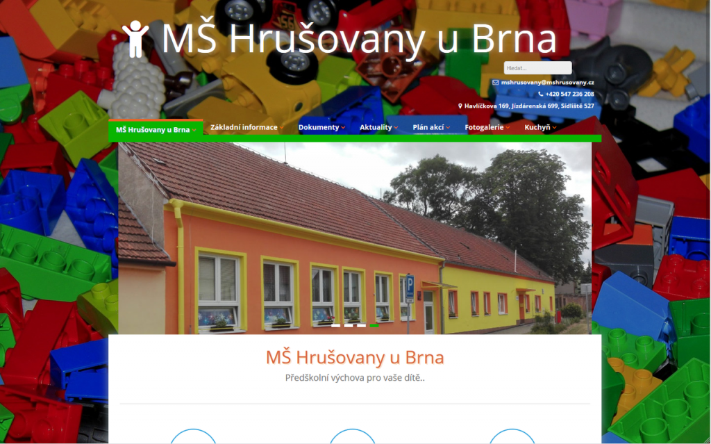
It is interesting how many people do not realize that the kindergarten websites are not intended for children (who usually cannot read), but for parents looking for information. So when you put together one kindergarten with 3 workplaces on one website and a mad graphic designer, the result is clear – yet quite typical.
Hrušovany Kindergarten decided to do something about it. The starter was the legal requirement for web accessibility, but fortunately it was not just this. It was also an idea that a good school website does not have to be infantile, but mainly that visitors must easily find all the information they need.
Evaluation of the original website
Complicated menu
- When the visitor was looking for information in the menu, he had to click through up to 4 levels. The pages were divided in terms of content and then into individual kindergartens, or further into kindergarten classes, e.g. Basic information → Our classes → Kindergarten Havlíčkova → Ladybugs class or Kitchen → Payments → Kindergarten Havlíčkova
- Some links pointed to pages with only one link or file, e.g. Documents → Basic information about SEP or Documents → School regulations.
- Some pages have been listed several times in multiple menu locations, e.g. the Operating rules of the canteen were in Kitchen → Operating rules and also in Basic information → Tuition and meals → Operating rules
- The website contained pages that had no content – they were not filled at all, e.g. Photo Gallery → Joint Events
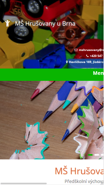
Unsatisfactory graphics
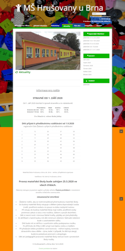
- The strong background distracted you as you browsed the web. The background image was also too large and significantly slowed down web loading.
Illogical content
- Sections with similar content were in several places
- Where to find us (only maps with address)
- Contacts (address, emails, phones)
- For example, the complete text of the “registration for meals” was listed on the page with the information: „Do not print this registration, it will be handed over to you at the parents’ meeting in August with the assigned variable symbol.”
Confusing pages
- The entire contents of the articles were listed in the news section
- Orientation in the text was hampered by the inconsistency of headings and articles eg
- different size headings,
- some headings were written in capital letters, others were not,
- the whole text of some articles was bold, etc.
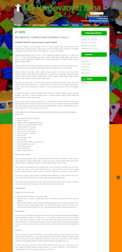
- Important information on the website were often only in PDF files or as images, not as text directly on the website, e.g. menus
Discrepancy with accessibility requirements according to WCAG 2.1
- The site was not responsive
- Links to skip to main content and other sections were missing
- The web menu was not keyboard-operable
- The website did not meet the requirements for contrast (web menu)
- Information were inserted as pictures without other textual annotation, e.g. Open Day, Enrollment in Kindergarten, Projects, Operation on summer holidays, Allergens …
- Rotating stars at sections, which could not be stopped it
- The structure and controls were inconsistent
Benefits of the new website
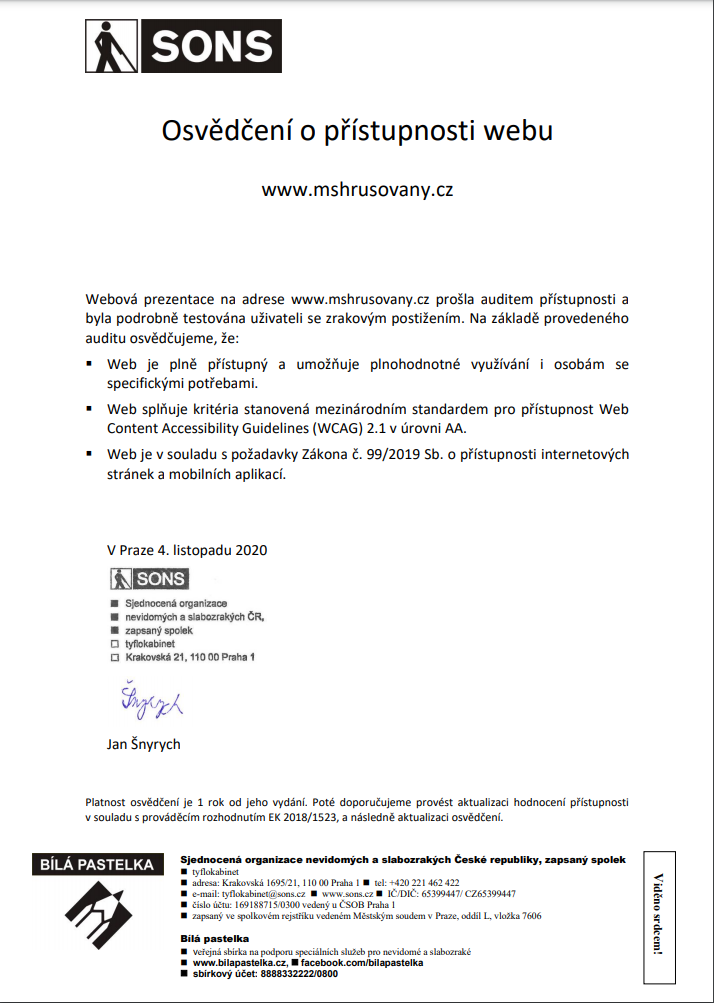
The website is fully accessible for the disabled people
We have obtained the Certificate of Web Accessibility from SONS. The website meets the WCAG 2.1 criteria at the AA level
- The technical solution of accessibility included mainly:
- fully responsive web,
- fine-tuned color contrasts,
- links to skip to navigation and main content,
- solution of duplicate links,
- accessibility of all web controls from the keyboard (incl. menu),
- control and orientation on the web so that it is consistent on all sites, etc.
- The content was also fundamentally revised:
- maximized information inserted on the web as text,
- all PDF documents supplemented with a text layer,
- all images carrying information contain alternative descriptions,
- Information on the pages is structured using multi-level headings.
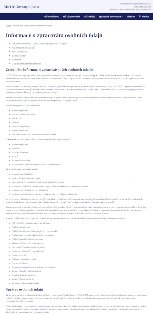
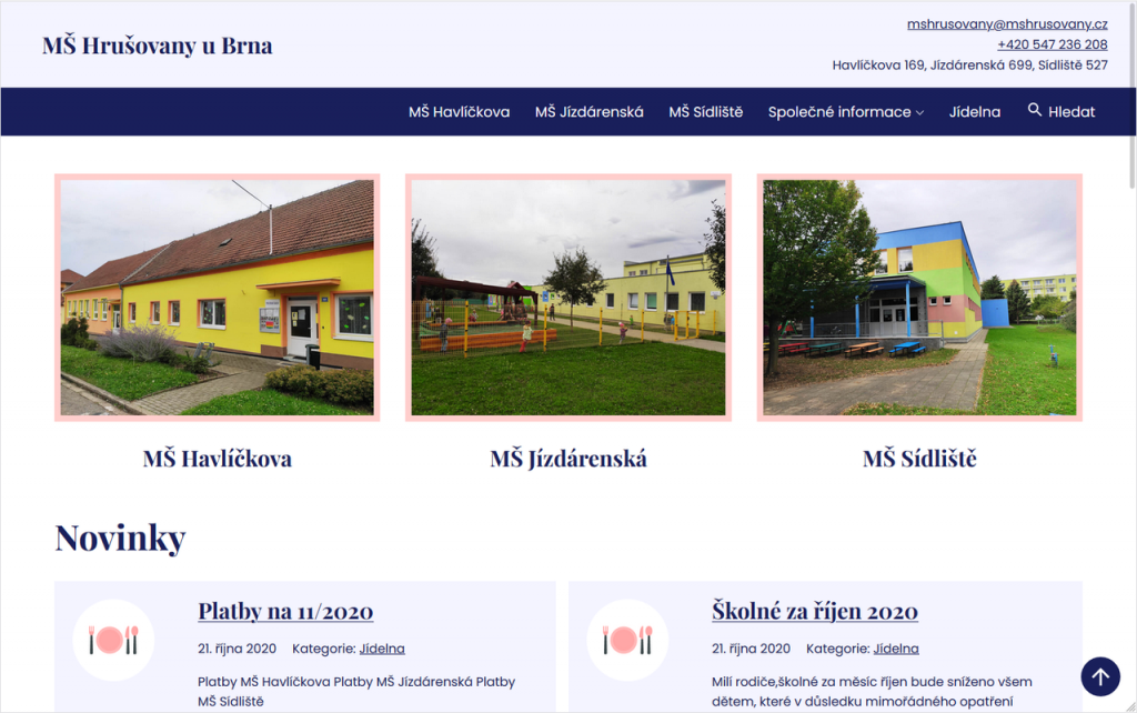
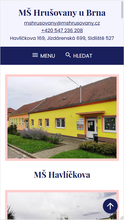
Simplified structure and navigation on the website
- The menu has only 2 levels.
- The structure has been changed so that each workplace has a separate item in the menu and common informations are inserted into one place.
- All documents of the kindergarten are on one page.
Mobile web
- The site is fully responsive.
- Significant speed increase of loading.
Simplicity and clarity
- The contacts for the kindergarten are unified in the footer of each page (all workplaces and canteen).
- All information about one workplace is on one page.
- Information is always in one place on the web – it is easier to find and better maintained.
- The site does not contain any blank pages.
- Larger pages have contents section with links to individual sections in the beginning.
- The „Back to Top“ link allows the user to go to the top of the page.
- In the news overview, only a brief excerpt of the article with a link to the full article is given.
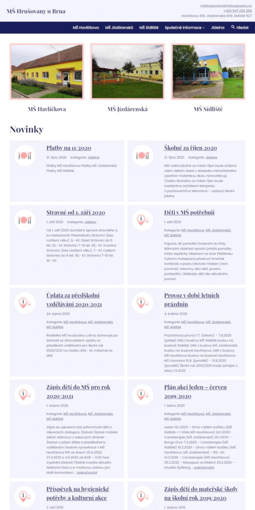
Unified graphics
- Graphic elements use 4 basic colors.
- The size of the headlines is unified across the web.
- News icons facilitate visual orientation. (according to the given category.)
Summary
What to write in conclusion? Even a kindergarten in a village with three thousand inhabitants can have a website that is modern, fast, functional, clear and accessible.