Once upon a time…
…there were the six primary schools in Trutnov. They need to define and differentiate themselves and also attract attention. Primary school Trutnov 2 Mládežnická tried to achieve this with a colorful, graphically distinctive and very comprehensive website. Primary School Mládežnická is progressive and successful school, with lots of activities. In addition to the usual things like after-school care centre and school club, it offers school hobby groups and courses at the Eldorado Club. The school is very focused on sports activities and modern digital technologies. The school is also involved in international projects (Erasmus, E-Twinning) and students are participating in skills, knowledge and art competitions.
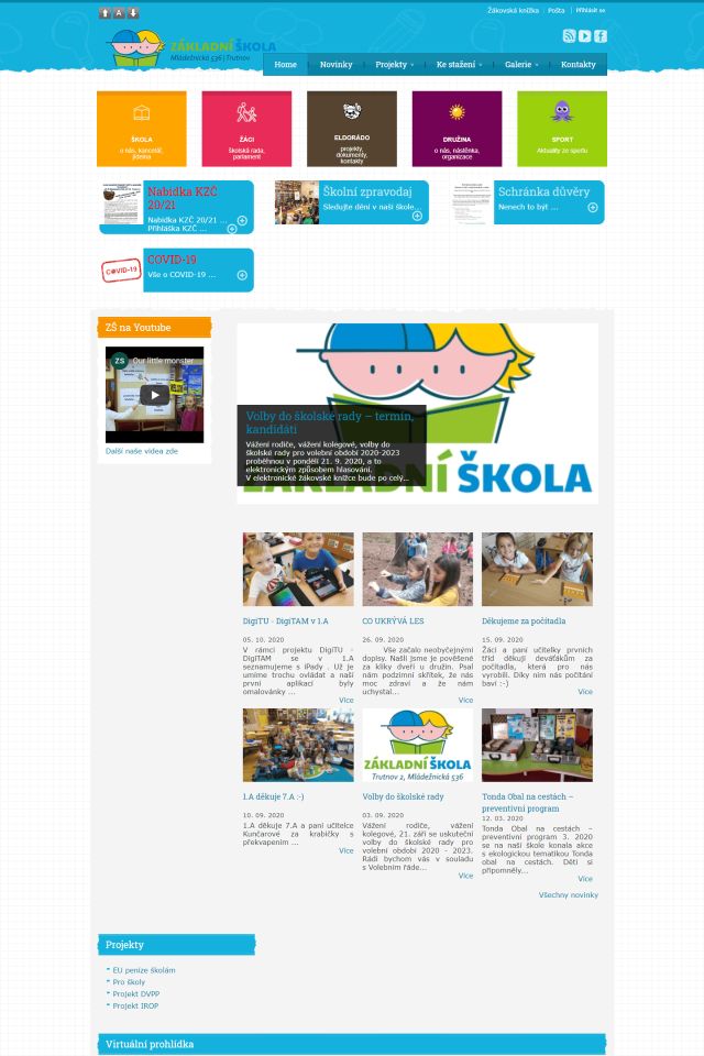
All this contributed to the fact that the school website became a little well-arranged labyrinth over time, where the visitor was easily lost. On the home page, the user did not know what to click. If user didn’t know the web well, he had to wonder where the information he was looking for might be. Related information was also often in different places. On the contrary, some information was duplicated in different places in different navigation menus several times.
How we helped
Our work was performed in 3 stages:
- we went trough an analysis of the original website
- we proposed a change in the structure and a new graphic design
- we transferred key content from the original website and significantly modified it for the the new one
Evaluation of the original website
The basis of our work was to go through the web and find out where what was hidden. We have identified a number of shortcomings.
Complicated navigation
- The website contains several independent menus
- Top bar – login to the student’s book, to the email, to the website
- Links to share – RSS, Youtube, Facebook
- Navigation in the page header
- Main navigation in the sidebar, which had up to 3 levels – it changes on the home page to squares at the top of the page
- Projects menu – visible only on the home page
Inconsistency
- The location of the main menu was in a different places on the home page and on the other pages
- For several pages, News was listed first and content of the page was below them, for most of the pages it was the opposite
- Some links from the menu referred directly outside the school website
Confusing or incomplete pages
- It was not clear where to look for stuff, navigation overlapped with the content, similar information were in more menus
- Some content (e.g. projects) was divided into several menus
- Similar information were divided into several pages – the user had to click through the site unnecessarily before he got the required information
- Some pages resembled „coloring books“ – multicolored texts were used so that it was not clear which information was most important on the page
- Underlining of the text was used both to differentiate links and just to highlight text
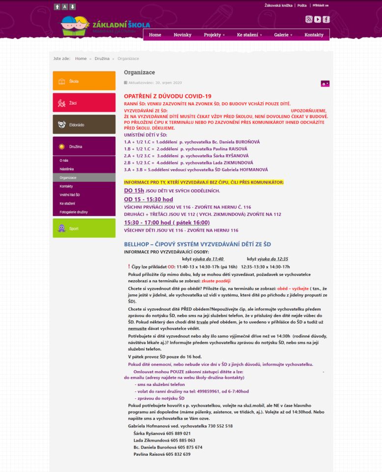
- Important information (e.g. specific measures due to COVID-19 for the school) were listed only in PDF files, not in text form directly on the site
- Mandatory published information according to Act No. 106/1999, Coll., were missing
Inaccessible content (against WCAG 2.1)
- Links were missing for quickly changing-over to the main content (criterion 2.4.1 level A)
- Some menu items were not accessible from the keyboard (criterion 2.1.1 level A)
- The text and background colors used were not sufficiently contrasting (criterion 1.4.3 level AA) . The first level of the side menu (if it had the submenu opened) had white text on a white background – the text was not visible at all
- Some information was inserted into the tables unnecessarily, which caused problems with responsiveness on the mobile phone (criterion 1.4.10 level AA)
- Link texts were only a web addresses without an explanation of where the links lead to (criterion 2.4.4 level A)
- Rotating content (so-called Carousel) on the front page stole user attention from the other web content and could not be stopped (criterion 2.2.2 level A)
- Some headings were not really headings, but only text formatted in the same way, lists were not actual lists (criteria 1.3.1 level A and 2.4.6 level AA)
- Spaces were used in the articles to format and indent text (criterion 1.3.2 level A)
- Bad text wrapping caused mostly by incorrect copying from a text editor (eg article TRUTNOV DRAGON was dominated by home teams) (criterion 1.3.2 level A)
- There were abbreviated words and abbreviations that are incomprehensible for someone who didn’t know what it was, eg GaP, ŽP, etc. (criterion 3.1.4 of level AAA)
- …
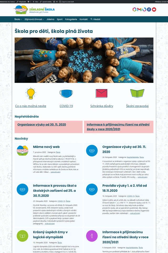
What was the result?
“The biggest benefit of the new website? Clarity, simplicity, easy orientation. ” Mgr. Zdeněk Géc, school principal
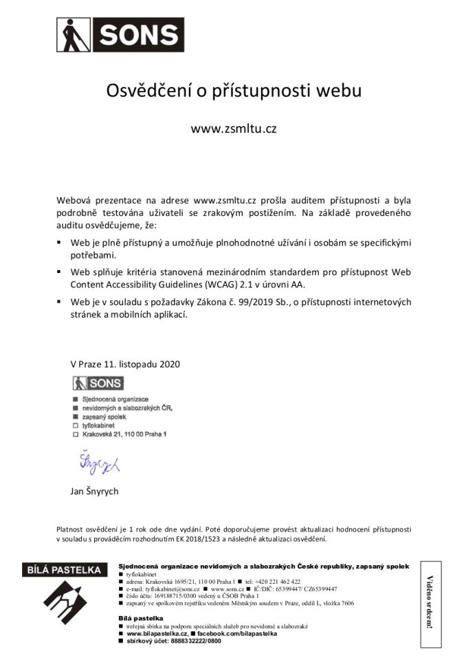
- The website is fully accessible in accordance with WCAG 2.1 criteria passing the AA level (and thus also Act 99/2019, Coll.). As always, accessibility of the website was verified by SONS.
- There is only one menu left on the site, which has only 2 levels. The original 79 selections of menu narrowed to 22.
- Visual style has been unified across the web.
- Information is always in one place. This makes them easier to update and easier to find.
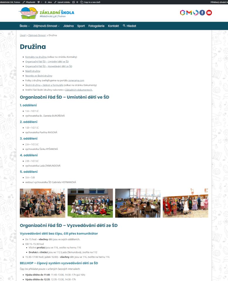
- We have merged pages with similar content into one (After-school Care Centre, Projects, School Club Octopus…).
- Maximum amount of information is inserted as text directly on the site, instead of the original external documents, images with text, etc.
- News from the given category are also listed on the relevant pages (COVID-19, Family, Octopus, Eldorado, Sport).
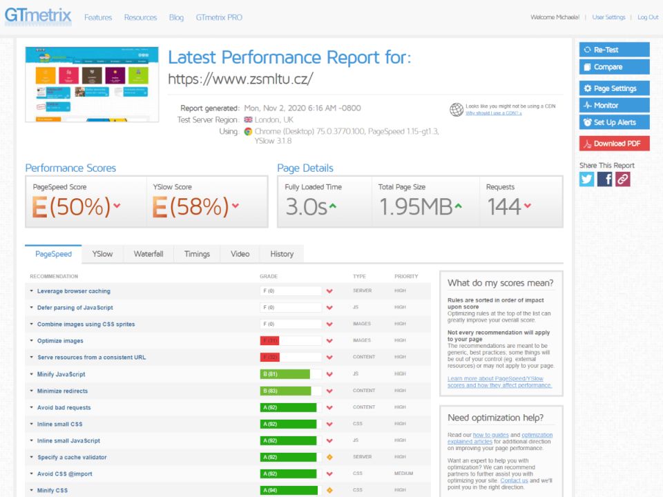
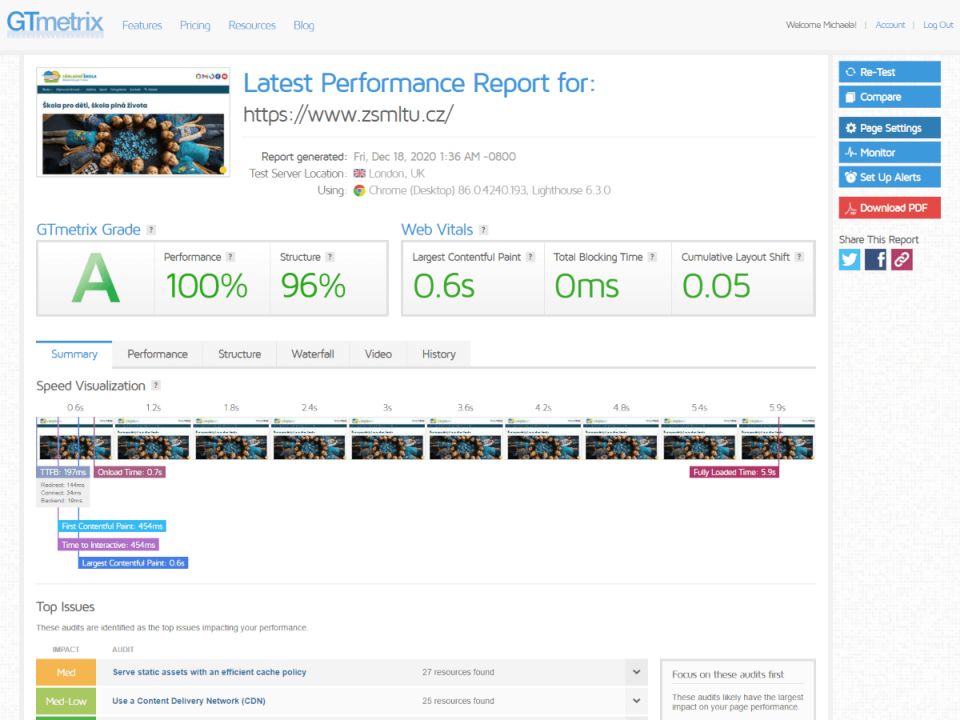
- Web loading has accelerated significantly, both on the computer and on the mobile phone.
The WordPress content management system and our Accessible School Theme template are used on the new website. We created this template in order to easily meet the requirements of web accessibility according to the WCAG 2.1 specification. Originally, there were concerns about whether the template could serve such a demanding website – but the template was used without any problems. We did not encounter any technical problems and we were therefore able to focus on optimizing the content and the structure.
What to write in conclusion?
Do you also manage broadly focused school? Do you need not only to modify your website to meet the accessibility criteria, but really improve it? Contact us. We are not afraid of challenges. We work on each project individually and with dedication.