
From September this year, all primary school websites must comply with the so-called accessibility rules. The point is to make the website usable and accessible for people with disabilities, such as the blind and partially sighted or deaf.
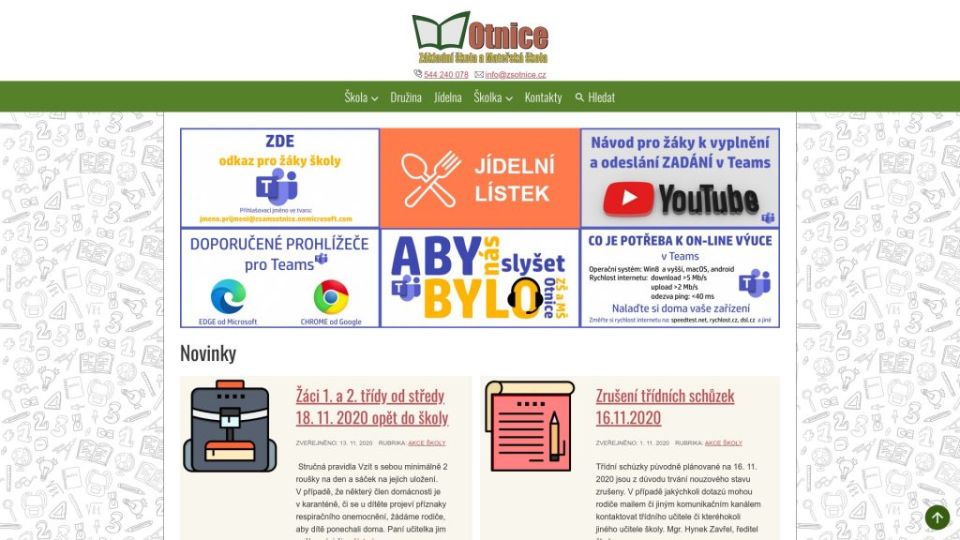
We have recently implemented our solution for schools based on the WordPress platform on www.zsotnice.cz, which is website of the primary and nursery school in Otnice.
For the existing pages, we have identified the following issues in terms of accessibility and simple user friendliness:
Complicated web navigation:
- web contained 2 navigations (menus) that overlapped with content,
- one of the menu had 3 levels.
Introductory carrousel(automatically rotating page content), which distracted from other information (this element is considered inaccessible content). Web complexity:
- the entire content of the posts was listed in the list of posts, due to some posts the user had to scroll through several pages,
- web contained pages that had no content (were not filled),
- the site contained information that does not belong to the website – personal information, such as a list of students who paid for a ski course, etc.,
- similar information was divided into several pages – the user had to click through the site unnecessarily before getting the required information.
Web opacity:
- important information was on the web only in PDF files, not in a “plain text” form directly on the web, for example Clubs, Organization of the School Year, Meal Payments, Tuition Fees,
- some links on the site were provided only by the URL of the link, it was not clear exactly what content the user would get to, for example important resources for choosing a profession,
- menu items had several colors for no apparent purpose.
Inaccessible content:
- cross references were missing,
- the web menu was not controllable from the keyboard,
- the site did not meet the requirement for contrasting colors,
- small web font,
- the website was not responsive – it was practically unusable on a mobile phone,
- when browsing the web from the keyboard, it was not clear which link the user was on,
- the download files were listed by file name, not content description.
So what did the new website from our production actually bring to the school in Otnice?
- Simplified web navigation – only 1 menu with 2 levels and an uniform color
- Simplification of the website:
- pages with similar content are merged into one,
- maximum information embedded on the web directly in the texts,
- information on the web are always in one place – better searchable and are better maintained,
- blank pages removed.
- Web acceleration.
- Responsive website.
- Contacts to the school directly in the header and footer of each page.
- Easy embedding of content on the web.
- The website complies with the accessibility rules.
We were happy that we helped to solve the requirements of accessibility for the website of the Primary and nursery School in Otnice. We thank the school management for their cooperation and we wish that their new website www.zsotnice.cz will satisfy the school, parents and students.